Galleria sign in ARC Raiders: what it means and why players keep stopping to read it
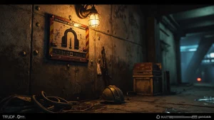
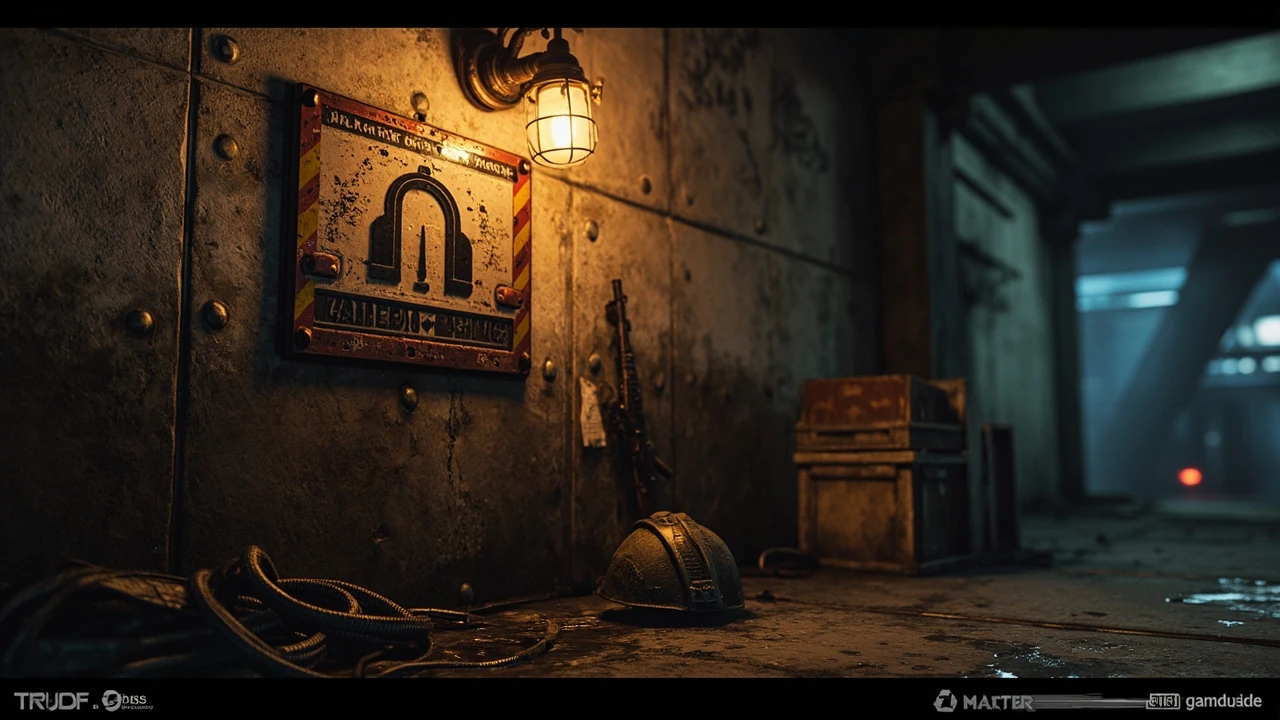
Walk into the underground concourse below the ruined commercial district and the first thing most squads notice is a wide metal plate bolted to a riveted column: a broad arch stamped into riveted steel, framed by worn yellow and red stripes, with a sub-label that players and guides call the galleria sign arc raiders players use as a landmark. It is not a quest marker, and it is not a vendor. It is environmental storytelling in the form of a district marker, the same kind of in-world wayfinding signage that real malls, train stations, and airports rely on to make a large interior legible at a glance. For a game built around extraction runs, where the difference between a clean exfil and a lost loadout can come down to one misread doorway, that kind of legible signpost is not decoration. It is interface.
This guide explains what the galleria sign actually is, how the development team uses it inside ARC Raiders, where it tends to appear, and how the design choices behind it shape player behavior and atmosphere. Whether you are a player trying to navigate a particular map, a designer studying environmental wayfinding, or an environment artist comparing signage passes between projects, the same mechanics apply. The sign has to be readable from a run, recognizable from across a room, and consistent enough that the community can name it without ambiguity. That is a harder bar to clear than it sounds, and it is the reason the sign has become one of the more discussed props in the extraction-shooter conversation.
What the galleria sign is in ARC Raiders
The galleria sign is an in-world district marker for the Galleria, the ruined commercial and transit complex that anchors several of ARC Raiders’ extraction maps. As an environmental prop, it does three things at once. First, it labels a place. Second, it suggests what that place used to be. Third, it gives players a fixed, named reference point they can use in callouts, guides, and squad chatter without depending on HUD overlays.
Players frequently call out “at the galleria” or “by the big sign” during a match, and that shorthand only works because the sign is large, lit, and visually distinct from the hundreds of smaller signs, posters, and panels the level design team has scattered around the map. In an extraction shooter, where most of the information players trade with each other is verbal, that visual anchor is part of the social contract between the game and its community.
How the sign is presented in the world
The most common version of the sign is a wide rectangular metal plate, roughly 1.2 to 1.6 meters across, mounted on a riveted column or hung from a ceiling beam at chest-to-head height. The dominant motif is a stylised arch, a direct reference to the kind of entrance archway that traditional shopping galleries used to mark their main concourse. The arch is paired with diagonal yellow and red hazard stripes along the bottom edge, which is a standard safety-design language for marking the boundary between a public circulation space and a more dangerous service area.
Lighting is consistent across instances of the sign. A caged industrial lamp or a recessed warm-white fixture throws a soft pool of light over the plate, and a secondary cool spill from a nearby vent or storefront window adds a slight rim. That combination keeps the sign readable in shadow without making it look like a UI element. The plate itself is weathered: scratched paint, surface rust, dents, and the occasional bullet or claw mark. The wear is part of the story. The sign is older than the current crisis, and the damage on it is meant to look like the consequence of years of neglect, not of a single firefight.
What the sign communicates to players
For a solo player or a squad, the sign carries a small bundle of useful information that experienced players internalise quickly:
- You are inside the Galleria district, which is one of the larger interior maps in the rotation.
- You are likely near a transit node, a service corridor, or a major concourse, since the sign is used to mark those edges.
- Expect mixed line-of-sight: store fronts, escalator wells, and kiosks break up sightlines around the sign.
- Expect heavier Raider and ARC presence, because the design team clusters enemy spawns around named landmarks rather than spreading them evenly.
None of this is hard-coded into the sign itself. It is a pattern players learn from repeated play, which is the most durable kind of in-world communication a level can have.
Where the galleria sign typically appears
Although the exact placement of landmarks shifts as Embark Studios iterates on map balance, the galleria sign is consistently used at the boundaries between three spatial types: a public concourse, a service or back-of-house area, and an exterior perimeter. That is not a coincidence. Those are exactly the boundaries where players most often get disoriented, and where a clear sign has the highest return on environment art cost.
Concourse entrances
The most common placement is the threshold between a main shopping concourse and a side service corridor. The sign sits just past the doorframe, perpendicular to the direction of travel, so a player walking in from the corridor sees it in profile and a player walking in from the concourse sees it face-on. This dual-angle placement is a classic wayfinding trick. The face-on view is the “you are here” reading; the profile view is the “this is the way out” reading. Both readings matter, and the sign is sized to deliver them.
Transit nodes
The second common placement is near transit nodes, including the entry shafts that connect the underground Galleria to the surface and the maintenance tunnels that connect different sections of the complex. These nodes are where the map design needs the most help, because they are also where the player is most likely to be ambushed. Putting a familiar sign at a transit node gives players a soft landmark they can orient on, even if the immediate area is chaotic.
Perimeter boundaries
The third placement is at perimeter boundaries where the Galleria map edges into a more open, less sheltered area. The sign in these spots is often paired with a barricade, a heavy door, or a breach point. In those cases, the sign is doing double duty. It is labeling a district, but it is also cueing the player that the combat pattern is about to change: more open sightlines, longer engagement ranges, and more vulnerability to long-range ARC units.
Reading the sign at a glance: visual language cheat sheet
Players who know what to look for can read the sign in well under a second. The visual language is deliberately simple, because extraction shooters demand fast decisions and any environmental prop that takes more than a second to parse is a candidate for being cut during playtest.
| Visual element | What it looks like | What it signals to a player |
|---|---|---|
| Stylised arch | Wide, rounded arch stamped or painted on the plate | You are at a major entrance or threshold, not a side passage |
| Yellow and red hazard stripes | Diagonal bands along the bottom of the plate | The area beyond has operational risk, often service or maintenance |
| Warm caged lamp | Industrial fixture casting a soft pool of light | The sign is meant to be read at distance and in low light |
| Surface weathering | Scratches, dents, rust, occasional impact marks | The sign is old, in-world, and not part of the HUD |
| Sub-label panel | Small secondary plate below the arch | Provides a specific section or wing name when the area has subdivisions |
None of these signals are unique to ARC Raiders. They are part of a shared environmental language that level artists across the industry borrow from real architecture, industrial design, and safety signage. What matters is that the same five elements are reused consistently across every instance of the sign, so a player who has learned the pattern in one match can apply it in the next.
Why the sign has become a community landmark
In a game where most of the social layer is built around callouts, shared screenshots, and short clips, a piece of environmental art becomes part of the shared vocabulary only if players can name it. The galleria sign qualifies because three conditions are met at the same time.
First, the sign is visually distinctive. It is bigger, brighter, and more saturated than almost any other prop in its area, so it survives compression in a stream or a thumbnail. Second, the sign is in a high-traffic area. The places where it is placed are also the places where squads are most likely to fight, so it appears in the background of countless clips. Third, the sign has a short, memorable name. “Galleria sign” is three syllables, maps cleanly to a real-world concept, and survives translation into other languages without losing meaning.
Compare that to a more generic prop, like an unmarked crate or a generic door, and the difference is obvious. A crate can be anywhere. A door can be anywhere. The sign is only ever in one kind of place, and players can build a mental model around that. That is the same reason real-world malls use named wings, airports use lettered concourses, and subway systems use line colors: a name only does work when the name maps to a stable place.
How the sign shapes player behavior during a run
Even though the sign does not directly influence spawns, loot tables, or mission logic, it has measurable effects on how players move through a map. That is worth paying attention to, because it is a good case study in how environment art and level design interact with player psychology.
Routing decisions
Squads planning a route through the Galleria tend to use the sign as a waypoint. “Push to the sign, then take the south corridor” is a more reliable call than “push past the escalator and the kiosk” because the sign is a single, named, persistent feature. Designers studying routing behavior can read the sign as a proxy for where the design team has decided a threshold matters, which is useful both for balance passes and for accessibility review.
Risk perception
Players consistently rate the area immediately around the sign as higher risk than equivalent interior space elsewhere on the map. That is partly because the enemy spawns are denser near the sign, and partly because the sign draws attention, which means the area around it tends to see more passing traffic from other squads. Designers who want to reduce the chokepoint effect can offset the sign’s gravitational pull by adding secondary landmarks near it, so that the sign is not the only thing pulling players into a corridor.
Recovery behavior
When a squad is wiped and a teammate is spectating, the sign is often the first landmark the surviving player is asked to look for. “Find the sign” is a cleaner call than “find the escalator with the red awning”, and it gives the spectator a single high-contrast target to look for on the screen. This is a small thing, but it is the kind of small thing that compounds across thousands of hours of play.
Design lessons from the galleria sign
For environment artists, level designers, and technical artists who want to study the sign as a piece of game design rather than as a piece of decoration, there are a few specific choices worth pulling apart.
Sizing for distance and for thumbnail
The sign is sized to be readable from a typical engagement distance in the map, which is somewhere between 15 and 30 meters in the spaces where it appears. That range is not arbitrary. It is the distance at which a player is likely to first spot the sign while moving at a tactical pace, and it is also the distance at which the sign is still legible in a compressed stream thumbnail. Designing for both real-time readability and post-match media legibility is a useful constraint, because it forces the artist to commit to a clear silhouette and a small number of high-contrast elements.
Using a real-world referent
The arch is a direct reference to real shopping gallery architecture, and the hazard stripes are a direct reference to real industrial safety signage. Anchoring a fictional prop in a real-world referent does two things. It gives the prop instant legibility for players who have been in a real mall or a real warehouse, and it gives the prop an in-world justification that does not require an explicit lore dump. The sign does not have to explain itself. It just has to look like the kind of sign that exists in the kind of place the Galleria is supposed to be.
Keeping the silhouette simple
The sign’s silhouette is essentially a rectangle with a flat top, a small sub-label rectangle below it, and a strong horizontal stripe of hazard color along the bottom. There are no protruding bolts, no animated parts, no parallax layers, and no glow. That simplicity is a feature, not a limitation. A simple silhouette reads quickly in peripheral vision, does not break when the player is in motion blur, and does not interfere with the readability of other props in the same area.
Lighting as part of the design
Lighting on the sign is consistent across instances because it is part of the prop’s design, not a happy accident. The caged lamp and the warm pool are part of the same prefab as the sign itself, so when the environment team places the sign, the lighting is placed with it. That is the only way to guarantee that a sign is consistently readable from a run in every area where it appears, and it is a common mistake for early environment passes to treat lighting and prop placement as separate problems.
How the galleria sign compares to other landmark props in the genre
For additional context, Extraction shooters and large multiplayer shooters tend to develop a small canon of in-world landmarks that the community names and uses as callouts. The galleria sign sits inside that canon, and comparing it to its peers is a useful way to see what it does well and where its design could go further.
| Prop | Game | What it labels | Why players name it |
|---|---|---|---|
| Galleria sign | ARC Raiders | Major threshold in the Galleria district | Distinct silhouette, consistent lighting, short memorable name |
| Customs sign | Escape from Tarkov | Threshold into the Customs map | Real-world referent, high contrast, large size |
| Dorms marker | Escape from Tarkov | Interior of the Dorms building | Short, functional, repeated across the building |
| Resort lobby totem | Various extraction shooters | Central lobby on a resort map | Tall, lit, and isolated from surrounding props |
| Subway tile mosaic | Various urban shooters | Station identity | Real-world referent, color-coded |
The pattern is the same across the genre. A landmark prop works when it is visually distinct, semantically anchored in something players already know, and used consistently. When any of those three conditions breaks, the prop becomes background decoration instead of a wayfinding tool.
Common questions players ask about the sign
Because the sign is so visually present in the maps where it appears, it attracts a steady stream of community questions. Most of them are not really about the sign at all. They are about navigation, lore, or map design, and the sign is just the most visible thing in the area where the question is being asked.
Is the galleria sign a quest item?
No. The sign is purely environmental. It does not appear in the inventory, it does not count toward any objective, and it cannot be picked up or moved. Its only function is to label the area and to give players a stable reference point.
Does the sign change between matches?
The sign itself is consistent across matches. Its placement, lighting, and silhouette are baked into the map prefab. What changes is the surrounding context: which squads are in the area, which Raiders and ARCs are patrolling, and whether the players approaching the sign are in a fight or a patrol.
Why does the sign look so different from the smaller signs around it?
That contrast is intentional. The smaller signs in the Galleria are mostly store names, posters, and wayfinding arrows. They are sized for a person walking through a real mall, not for a player making fast decisions in a combat zone. The galleria sign is sized for the second case. It is the level’s way of saying “this is a threshold that matters to your route” without using a HUD element.
Can the sign be used as a hiding spot?
In practice, the column the sign is mounted on is often thick enough to break line of sight from one side, and the lighting around the sign is set up so that a player crouched in its shadow is harder to spot from a distance. Whether that is an intended design or a happy byproduct of the prop’s geometry is a question the environment team would need to answer directly. From a player’s perspective, it is one of the more reliable close-cover options in the area, which is itself a useful piece of routing information.
Does the sign appear in every map in ARC Raiders?
No. The galleria sign is specific to the maps that include the Galleria district. Other districts in the game have their own landmark props, with their own visual languages and their own community names. The sign’s usefulness as a wayfinding tool is partly that it only appears where it is meaningful.
How to use the sign as a player
For a player who is still learning the Galleria maps, the sign can be folded into a personal navigation system in a few simple steps.
- Spawn in and orient on the sign first, before committing to a direction. The sign is large enough to spot from most spawn positions in the district.
- Decide whether your route goes through the threshold the sign marks, or whether you are using the sign as a reference and skirting around it. Both are valid, but they imply different risk profiles.
- Use the sign in callouts. “At the sign”, “past the sign”, “under the sign” are all short, clear phrases that survive radio compression.
- When spectating, treat the sign as the first thing to look for. It will usually be the highest-contrast element in the area.
- When reviewing a clip, the sign is a useful anchor for editing. It gives a viewer a stable visual reference while the camera moves around.
None of these are advanced techniques. They are the kind of small habits that experienced players build up without thinking, and they are exactly the habits the sign is designed to support.
How to design a sign like this in your own project
For developers working on a project of their own, the galleria sign is a useful template for any landmark prop, and the design process is roughly the same regardless of engine, scale, or genre. The list below is a practical checklist that maps to typical environment art and level design workflows.
- Pick a real-world referent. Find a class of real-world sign that already does the job you need: wayfinding, safety, transit, district identity.
- Reduce the referent to a silhouette. Strip color, text, and surface detail until you are left with a shape that reads at engagement distance and in a thumbnail.
- Choose one high-contrast color pair. The galleria sign uses warm yellow and red against cool concrete. Pick a pair that survives compression and that does not collide with the game’s HUD palette.
- Lock lighting into the prop. Make the lamp or light fixture part of the same prefab as the sign, so the readability of the sign does not depend on a level designer remembering to light it.
- Define the boundary. Decide in advance what the sign labels: a threshold, a district, a transit node, a perimeter. Use the sign only at that kind of boundary, and never as a generic decoration.
- Test in playtest. Watch where players look when they spawn. If the sign is not in the first three things they look at, the silhouette or the lighting needs work.
- Name the prop in the project. Internal names like “Prop_Landmark_Galleria_Sign” make it easy for level designers to find, place, and audit the prop across a map.
This is the same set of decisions Embark Studios has made for the galleria sign, and the same set of decisions any studio has to make for any prop that has to do real work in a level.
What to watch for in future updates
Extraction shooters evolve. Maps get rebalanced, landmarks get moved, and sometimes entire districts are rebuilt. The galleria sign as it exists today is the version that shipped with the current map set, and the only honest answer to “where will the sign be next” is that it will be wherever the design team decides the Galleria’s most important thresholds are in the next iteration. For a player, that means treating the sign as a stable reference inside the current patch, and being ready to re-learn its placement after a major update. For a designer, that means planning for the sign to be moved, hidden, or rebuilt without breaking the community’s mental model of the map. Either way, the design lessons from the sign are more durable than any specific placement.
For more context on how the development team thinks about extraction maps and the place of in-world landmarks inside them, the ARC Raiders entry on Wikipedia gives a useful overview of the game’s design goals and development history. For a closer read on the in-game feel of the maps and how landmark props interact with the rest of the environment, the ARC Raiders impressions piece from Game Informer walks through what works and what does not during real play sessions.
Frequently asked questions
What is the galleria sign in ARC Raiders?
The galleria sign is a large in-world metal plate with a stylised arch and yellow-red hazard stripes that marks the thresholds of the Galleria district. It is purely environmental, but it has become a community landmark because it is visually distinctive, consistently lit, and easy to name in a callout.
Is the galleria sign an objective or a quest item?
No. The sign is not an objective, does not appear in the inventory, and does not count toward any mission. It is a wayfinding prop, and its function is to label a place and to give players a stable visual reference.
Where on the map is the sign most often placed?
The sign is most often placed at three kinds of boundary: the entrance to a main concourse, a transit node that connects sections of the complex, and the perimeter where the Galleria opens into a less sheltered area. In all three cases, the sign marks a change in combat or routing pattern that the design team wants players to notice.
Why is the sign lit so brightly compared to the rest of the map?
The sign is lit more strongly than surrounding props so that it remains readable at engagement distance, in low light, and in compressed media like stream thumbnails. The lighting is part of the prop’s prefab, which is how the environment team guarantees that consistency across every instance of the sign.
Can players use the sign as cover?
The column or beam the sign is mounted on is often thick enough to break line of sight at close range, and the shadow cast by the sign’s light fixture is deep enough to hide a crouched player from a moderate distance. Whether that is intentional depends on the design team, but it is a reliable piece of close-range cover in practice.
Does the galleria sign change between seasons or patches?
The sign itself is part of the map prefab and is consistent across matches. Its placement, lighting, and silhouette will only change if the design team reworks the Galleria maps, which can happen during major updates. Players should treat the current placement as stable within a patch and be ready to relearn it after a major rework.
What does the arch on the sign actually represent?
The arch is a direct visual reference to the entrance archways of real-world shopping galleries. It is a shorthand for “this is a major public threshold”, and it borrows its legibility from architecture that most players have already seen in real life.
Why are there hazard stripes on a district marker?
The diagonal yellow and red stripes are borrowed from industrial safety signage, where they mark the boundary between a public circulation space and a more dangerous service area. The sign reuses that language to tell the player that the threshold the sign marks is also a transition into a more dangerous part of the map.
How does the sign help during a wipe or a spectate?
When a squad is wiped, the sign is often the easiest high-contrast landmark for a spectator to find on the screen, and it gives the surviving player a single stable reference point to navigate back to. That is one of the reasons “find the sign” has become a common callout in the community.
What can environment artists learn from the galleria sign?
Three things stand out. First, anchor a fictional prop in a real-world referent so it does not need an explicit lore explanation. Second, lock lighting into the prop so its readability does not depend on a separate lighting pass. Third, restrict the prop to a single semantic role and use it only where that role applies, so the community can build a stable mental model around it.